May CPI was similar to April's in that it came in in-line, but the underlying details were more encouraging. May Headline CPI increased 0.1% month-over-month, less than (better) than the 0.2% increase that was expected, while Core CPI (which excludes the volatile categories of Food and Energy) increased 0.4% month-over-month, in-line with expectations for another 0.4% increase. On a year-over-year basis, headline CPI fell to 4%, the lowest in two years and below expectations for 4.1%. Core Inflation's Y/Y change came in at 5.3%, in-line with expectations.
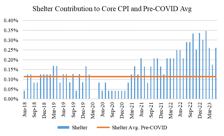
The Fed has divided inflation into three buckets: goods, services ex. shelter, and shelter. This month, similar to last month, goods contributed about 16 bps of the 45 bps (unrounded) monthly increase in Core CPI (recall this was 0.4%). Also similar to April's figures, Services Ex. Shelter again contributed about 4 bps. Lastly, the Shelter component was one of the surprises this month, and contributed about 26 bps, up from last month's 17 bps but in-line with March's 26 bps contribution. Below are charts showing these contributions, as well as in relation to their Pre-COVID averages.
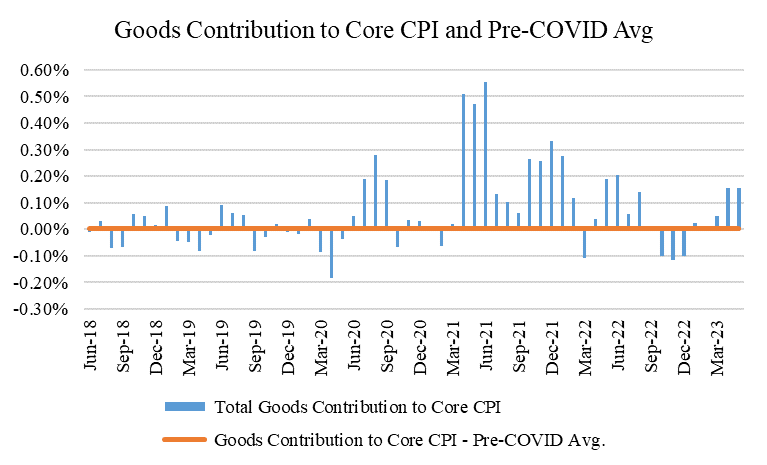
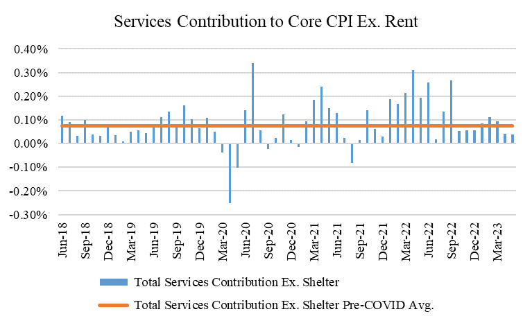
Two notable call outs here from these "headline" bucket figures. First, of the 16 bps contribution from goods, this month's goods inflation was again driven by used cars, which contributed 15 of the 16 bps (similar to last month, when used car prices contributed 14 of the 15 bps). Excluding used car prices then, goods inflation was again basically zero this month, generally in-line with its pre-COVID average. Given used car prices in the CPI operate with a lag, and used car prices have started to noticeably fall again in recent months (see here: https://publish.manheim.com/en/services/consulting/used-vehicle-value-index.html), this component should normalize in the coming months as well.
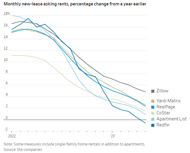
Second, it's unclear what drove the sequential acceleration in the contribution from Shelter. There's no specific market-based reason why the Shelter component would have gotten worse this month, given what's happened to rents in recent months. The WSJ had a good article on this this AM (https://www.wsj.com/articles/renters-are-about-to-get-the-upper-hand-f6387df4?mod=hp_lead_pos1), which showed several market-based rent indices showing that rent growth has meaningfully flattened out and in many cases actually gone negative. Thus, given the rent component of CPI also lags, there's no real reason to think that the moderation everyone is expecting in this component isn't still coming our way, though maybe it will not be as linear down as we hoped.
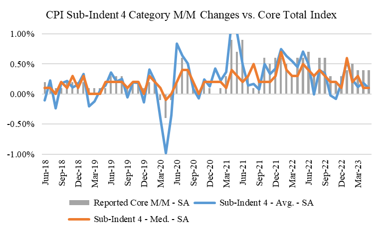
Furthermore, we also like to analyze the CPI data by looking at the median and average category increases. This helps assess inflationary breadth. We do this by looking at "Sub-Indents" 4 and 5 of the CPI data, the former of which includes a basket of 55 goods and services comprising 98% of the Core CPI Index itself. This month, the average and median increase for categories within Sub-Indent 4 was only 0.09% and 0.10%, each of which annualize to below the Fed's 2% inflation target (recall that given the CPI's different weightings, the Fed's 2% inflation target actually looks more like 2.4% or 2.5% on the CPI). This again demonstrates what we highlighted above, which is that several categories are driving outsized shares of the aggregate inflation indices, both in the core and headline. In this case, it's used cars and shelter. Notice the difference between the lines and the bars in the last few months in the chart below. Also notice that the lines are by and large back to their pre-COVID averages, hopefully a good sign for what's to come in the index itself.
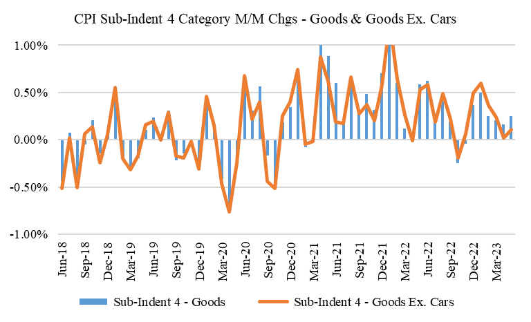
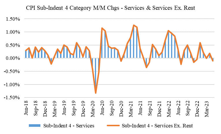
Here are two other charts from our Sub-Indent 4 data. The first looks at Goods inflation in our Sub-Indent 4 baskets (so in other words, goods categories within our list of 55 goods and services categories within Sub-Indent 4), and the second looks at Services. The Goods chart shows goods changes both including and excluding cars, while the Services chart shows services both including and excluding Shelter. The Goods chart shows what we already highlighted above, which is that goods inflation excluding cars (and particularly used cars) is quite subdued, and generally back to pre-COVID levels (roughly 0). The Services chart shows an even more positive trend, and indicates that the average services category this month excluding Shelter actually decreased. If looking at baskets of categories and examining their averages and median changes is a better indicator of inflationary breadth than just looking at the index in general, then this tells us that inflationary breadth within the all important Services Ex. Rent bucket continues to improve. The Fed should be happy.
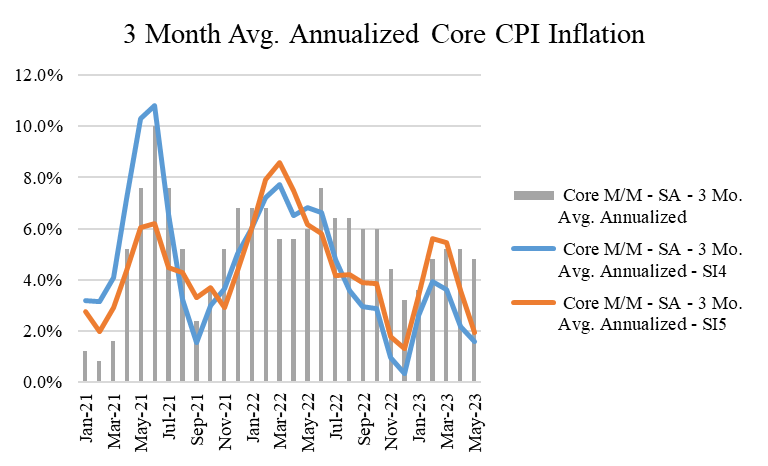
Lastly, let's show some of these figures on a 3 month basis. This chart too shows that inflationary breadth continues to improve (read: come down, or inflate less). As used car prices and shelter revert to the realities in their market, the gaps between the bars and the lines in this chart should start to converge too, and likely with the bars falling more than the lines rise. Also note that both Sub-Indent 4 and 5 on a 3 month basis are back down to annualized levels of inflation below the Fed's target (and well below if we assume the CPI target is ~2.5%).
All things considered, this was a positive CPI print, and it again demonstrates that despite some of the headlines being "in-line," the underlying details are actually quite a bit more encouraging. This should support the Fed's recent posturing towards a pause in interest rate hikes at its next meeting today and tomorrow, and also probably increases the odds that they're done raising interest rates altogether. More on that next month.

ความคิดเห็น