
The stock market has ripped higher since last Tuesday's election, but so too have interest rates. Fortunately, today's October CPI report shouldn't add to fears about the Fed's rate cutting cycle being prematurely cut short. We'll be a little briefer this month than we normally are, but let's go through this month's details.
October CPI increased by 0.2% and 0.3% on a headline and core basis, respectively (these figures are also month-over-month, and seasonally adjusted as well). Unrounded, the core figure was 0.28%, which was was generally in-line with expectations. On a year-over-year basis, headline inflation ticked up to 2.6% (from last month's 2.4%) while core CPI year-over-year remained at 3.3%.

As we usually do, let's go through our three "buckets": goods, core services ex. shelter, and shelter.
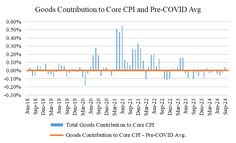
Goods this month contributed +1 bps to our monthly core total increase of +28 bps (0.28%). This was generally in-line with the pre-COVID average of 0. There was some moving pieces within this category, as there always are, but the two things to highlight were the -5 bps contribution from Apparel (which basically reversed last month's 4 bps positive contribution), and the +6 bps contribution from used car prices. These were large moves for each of these categories, and since used car prices remain in a generally downward trajectory, there probably isn't much hay to be made from this. Given the move back up in interest rates of late, any upward pressure on used car prices will probably quickly fade. Below are charts of the goods category's monthly contribution to core inflation, the contribution from used cars and trucks, as well as a chart of Manheim's used car price index.


Now let's turn to services ex. shelter (or "super core"). Things were generally pretty subdued here this month as well, including in bugaboo categories of late like auto insurance and medical care services. This month's +9 bps contribution was generally in-line with the pre-COVID average of +7 bps, so here too, there's little to write-home about, with the possible exception of airline fares, which again added +3 bps this month (versus their historical average of about zero). Similar to used car prices, there's no reason to get too fussed about this, since as the chart below shows, airline fares move around.


Our last bucket is shelter, which was the story of the month. Because we've told this story a million times, however, we won't tell it again, except to say that for whatever reason, the BLS found that shelter prices increased again this month at a rate well above its historical average. As a result, +18 bps of the +28 bps increase in core inflation was attributable to shelter cost increases. This was not only considerably above last month's total (+9 bps), but above this category's pre-COVID average as well (+7 bps). The charts below show both shelter's contribution to core monthly inflation over time, the pre-COVID average, and then beneath that, some charts from rent inflation (or deflation, as the case may be) from some private data providers that we've referenced in prior posts (ApartmentList, Realtor.com), both of which indicate that rents are flat at best and probably actually down year-over-year.


Lastly, let's also look at category level inflation so that we can track inflationary breadth. As a reminder, we do this by looking at what I like to call "Category Level 4" and "Category Level 5" categories of inflation. These sub-groups come from the BLS Table 2 of each month's CPI report (found in the Supplemental Table of Contents from each month's CPI release, here). By looking at Category Level 4 (a basket of 55 goods and services categories that comprise 98% of the core CPI) and Category Level 5 (a basket of 101 goods and services categories that comprise 78% of the core CPI), we can get a better sense of how much inflation is increasing on average across the economy. If the average and median increases amongst all these baskets is higher, then inflationary breadth (and thus, inflation itself) is likely higher, and just the opposite is true if average and median increases are lower (which would indicate more subdued inflation). Thankfully, the latter remains generally true in recent months, and this month continued that trend, with median and average increases for Category 4 and Category 5 of 0% and 0.2%, and 0.16% and 0.11%, respectively. All of these are consistent with the Fed's 2% inflation target, and thus, inflationary breadth in the economy currently seems to be pretty low. Ideally in the charts below, we want the lines to be a bit below the 0.20-0.25% level on the Y-axis, since 0.2% increases on a monthly basis annualize to about 2.4% inflation.


This last chart takes the data from the above charts, averages them over three months, and then annualizes it to get a better sense of what our category level data indicates as an economy wide level of inflation. The lines in the chart below have been consistently below the bars, simply because the bars report the aggregate core CPI index, which has a significant weighting from shelter. Because shelter inflation remains high in the CPI, the lines have remained below the bars. Lastly, though the lines have moved up in recent months, note their actual point on the graph: about 2% (exactly the Fed's inflation target).

In sum, October's CPI was a bit of a relief, since expectations for higher inflation in the Trump inflation had really started to pick up. The release's three notable callouts: airfares, used car prices, and shelter, can all be pretty easily looked through (especially since airfare prices in the CPI don't carry through to the PCE, which is the actual price index the Fed uses to target 2% inflation for). Bottom line, inflation in the economy still seems be around 2%, and may even be lower. It's therefore reasonable, and likely, that the Fed will continue to cut rates, at least in December anyways. Next year could be a totally different ballgame.
Comments